Wondering what is a brand identity is and how the best ones are created? Here we’ll break down the brand identities and leave you with clear examples and confidence when crafting your own brand identity. So, what is a brand identity?
A brand identity is a business’s unique personality, from its logo and colors to its messaging and customer experience. Brand identities set a business apart from competitors and make its audience feel a certain way when interacting with that brand.
That is just a brief overview of what a brand identity is! Read on to discover more about brand identity with real-world examples that showcase the power of branding
What Is A Branding Identity?
A brand identity includes a personality, values, tone of voice, and visuals like logo, colors, graphics, typography, etc. A better way to think of it is the soul of a business, it’s more than what you sell, it’s how you make people feel when they interact with your business. it’s the story you tell, the promises you keep, and the experience you deliver.
So what are some of the building blocks of a brand identity?
- Visual identity:
- Logo design: Simple, memorable and aligns with your audience
- Color palette: Psychology of colors and choosing a palette that reflects your brand personality
- Typography: Different fonts convey different vibes. Selecting fonts that align with your brand personality and resonate with your audience creates a strong visual connection.
- Imagery: visuals showcasing a brand in the world. Choosing images that align with your values and target audience helps connect with them on an emotional level
- Verbal identity:
- Brand name: memorable and represents a brand
- Tagline/slogan: a short phrase that captures your value proposition
- Sound: jingles, sometimes annoying, music, or specific sound effects that recall a brand or emotion without seeing it
- Values & mission:
- Core beliefs & Purpose: this guides business decisions and resonates with their target audience.
- Values: these are chosen to define who you are as a brand
- Customer experience:
- Packaging or print materials: Consistency across all physical touchpoints reinforces brand recognition, building trust and professionalism.
- Digital platforms: Websites, social media, and online presence further extend a brand identity.
- Interactions: From communication to service delivery, how you interact with clients shapes your brand.
Creating a strong brand identity takes effort, but the rewards are worth it. It attracts loyal customers, creates trust, separates you from competitors, and fuels your business growth.
Brand Identity Examples
And now for some in-depth brand identity real-world examples, and expert insights to help you with your brand identity goals.
Skip ahead with these links:
National Geographic
National Geographic, commonly known as Nat Geo, is a multimedia brand with a rich history. Originating as a scholarly journal in 1888, it transformed into a widely acclaimed magazine celebrated for its captivating photography and in-depth articles spanning science, nature, history, and culture.
Gretel an independent branding, strategy and design studio had the pleasure of rebranding the legacy brand for the modern age.
National Geographic extends its reach through award-winning documentaries and television channels that highlight its main theme. Additionally, it contributes to the literary world by publishing books, maps, and educational materials, with a focus on offerings for children and families.
Visuals Elements Of National Geographic’s Brand Identity
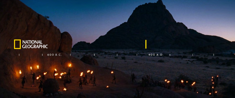
National Geographic’s iconic yellow border logo, its most recognizable element is a rectangular yellow frame that sometimes is used as a stand-in for the brand. The yellow frame represents a window to the world, inviting viewers to explore new horizons.
Their tagline, ‘Further’ fits their brand so well, it was inspired by Sir Isaac Newton who revolutionized our understanding of the universe as we know it. A fantastic source to derive their tagline from.
“If I have seen further it is by standing on the shoulders of giants”
Sir Isaac Newton (1676)

Bold imagery and stunning photographs are used to showcase the beauty and diversity of the world. Image selection is a crucial step in keeping that premium feel to the brand.
gives us the audience a feeling as if we are the explorers not just the observers.
The National Geographic brand intentionally chooses to avoid ‘beauty shots’ in their imagery, instead, they make sure there is a human element in their images this gives us the audience a feeling as if we are the explorers not just the observers.

Images have to empathize with the audience as well as feel like we are there in the front lines or in the thick of action. Other considerations are images with immense negative space, giving the feeling of how small we really are and that nature towers over man.
Because Nat Geo is a content-forward brand, it treats its images as the color palette. They let the texture and cinematography of their images shine through.

Yellow is used sparingly as accents and black as negative space to create a cinematic feel or as Nat Geo puts it “encourage the audience to explore further into the dark.”
National Geographic’s font of choice are san-serif fonts, Verlag and Neue Haas Grotesk (NHG), with NGH as a secondary font. Verlag is only used in uppercase throughout the brand and NHG for long bodies of text.

Their font choices are clean, minimal and simple with tracking, the space between letters, wider than normal. The combo of san serif font and wide tracking makes it easier to read on the sometimes noisy background images and it doesn’t distract from the imagery. Also, the font doesn’t have any ornamental decorations which would take away from the imagery.
Personality & Values of National Geographic’s Brand Identity
“Our brand of entertainment is rooted in reality, not limited by it.”
National Geographic
National Geographic’s ambitious goal is to become “the world’s premium science, adventure and exploration destination”. National Geographic seeks to uncover new frontiers and stake claims in the unknown they are committed to furthering world understanding, it serves as an intellectual guide through the complexities of our world.
National Geographic’s personality invites you along on the journey, encouraging everyone to push beyond, explore, and understand.
We seek, we explore, we take risks not just for that sake of adventure, but for the higher purpose of understanding.
National Geographic
National Geographic’s Brand Identity Across Channels
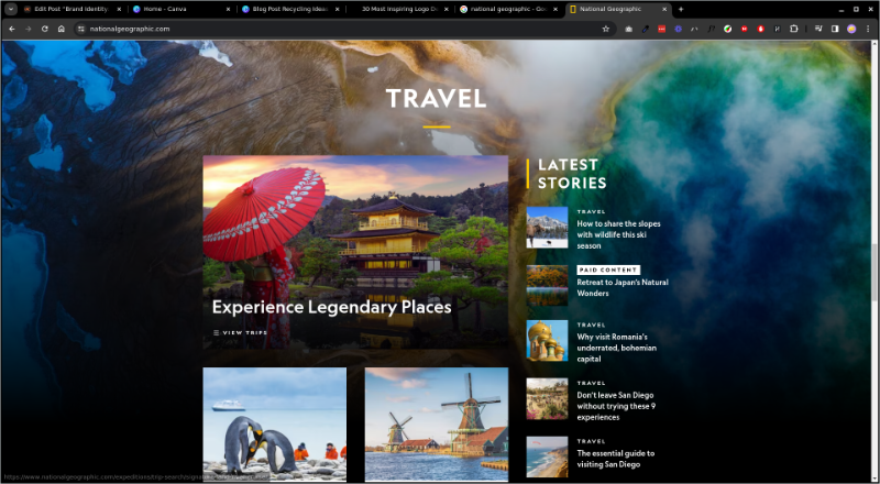
National Geographic’s brand identity is consistent on its website, the black background gives a cinematic feel and encourages you to explore and the subtle yellow accents guide the visitor’s eyes throughout the website to key content or call to actions.
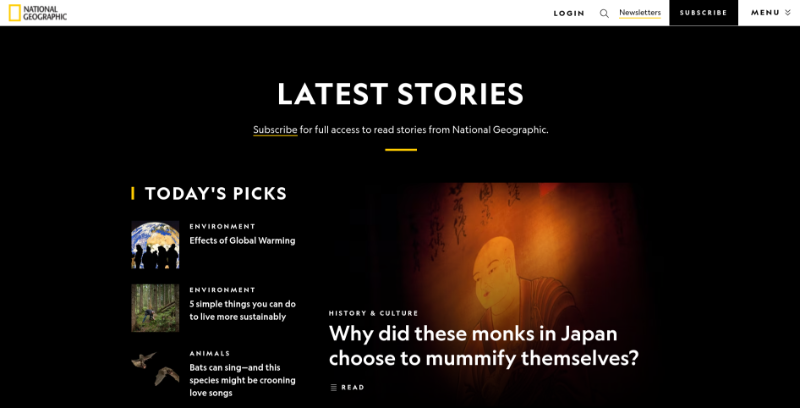
The clean minimal fonts let the images tell the story instead of overwhelming the audience and because National Geographic is a content-forward brand, they have added a background video that fits its imagery brand guidelines, no beauty shots, has human elements and feels like you’re on the front lines as the explorer.
What I think they have done really well is overlying images on top of the background image. This can be difficult because it can look messy and very crowded especially when you add text into the mix but Nat Geo pulled it off by choosing a background image that is not too noisy and having clean minimal fonts.
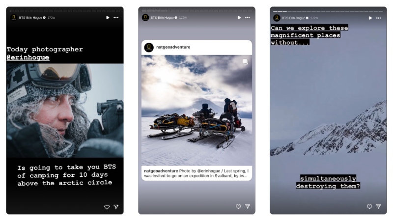
Another channel where Nat Geo’s brand identity shows is on their Instagram accounts. Yes, it is full of images that meet their guidelines but they take it a step further and share the explorers themselves to show behind the scenes of their expeditions. This is a great way to build on their values of science, adventure and exploration.
National Geographic’s Brand Identity Impact
The yellow border with the other visual elements and typography is iconic and instantly recognizable across generations and cultures. From magazines to documentaries, TV shows and social media, National Geographic’s reach is pretty far securing its position as a household name.
Both adults a children can enjoy their content which has built loyalty that has lasted generations, this is because they have decades of in-depth storytelling and amazing content. They have earned that brand trust and loyalty.
Because of their dedication to environmental awareness, educating and informing they have motivated countless individuals to take action and make a better planet and keep exploring and understanding these amazing wonders of the world.
Adobe
Adobe is pretty much everywhere. The majority of the content you have interacted with has been created with Adobe software, whether it is print or digital.
They are the global leader in digital marketing and digital media solutions, this is because of their vast content creation ecosystem. Adobe helps people like you and me to create amazing content, share it, measure it and optimize it over every channel.
Adobe’s brand identity was modernized by John Caponi. Designer, artist, musician, educator, and Adobe Senior Creative Director. See the full rebrand on his website Design:unknown
Creativity doesn’t just open doors, it opens worlds.
Adobe
Visuals Elements of Adobe’s Brand Identity
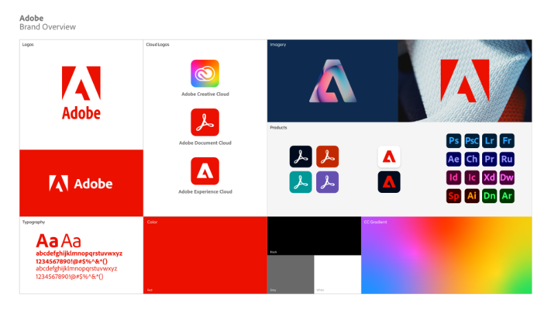
Adobe’s logo is a stylized ‘A’ that is created with the negative space created from the square it sits in. The current logo is a nod to the company’s original logo created in 1892 by Marva Warnock.
The color red is used to, as Adobe puts it elevate to “special” status and is primarily used for the main logo. If you use Adobe you’ll notice that they have a whole range of colors to represent their products like Photoshop, Illustrator, InDesign, etc,
Because of their large range of products that could be standalone brands, Adobe’s color palette is an open system, it is without a defined color palette. When they pair colors together, they use a combination of dynamic and neutral colors, not all dynamic or all neutral. Adobe’s idea behind this is, be creative.

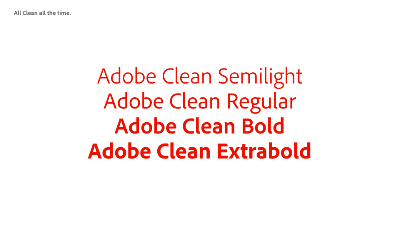
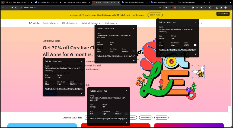
Adobe’s typography is clean and professional. The Adobe Clean family is a sans serif font and because is it so versatile it’s used throughout their entire branding like headings, subheadings and paragraph text across different platforms.
Based on Adobe’s brand guidelines, their imagery must consist of high concept images for corporate or product imagery, authentic, meaningful imagery for reportage lifestyle photography and conceptual imagery for themes or infographics. Clipart should never be used. ever. It shouldn’t be used for anything really, just my opinion.
Personality And Values of Adobe’s Brand Identity
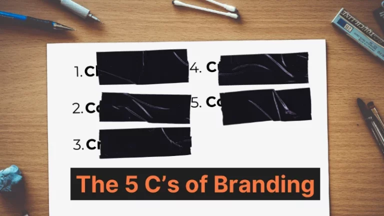
Adobe has 4 values, genuine, innovative, exceptional and involded. They balance simplicity with creativity, creativity being one of the five C’s of branding, and intending to captivate users through engaging design. Their passion for the future and community fuels their innovation and collaborative spirit. Integrity and respect are core values, leading to ethical behavior and trust within the company.
Adobe’s Brand Identity Across Channels
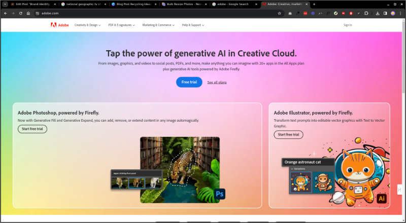
The brand identity of Adobe is consistent across its website. They take advantage of the white space and showcase their user-generated content, and upcoming summits and demonstrate their inspiring and innovative characteristics
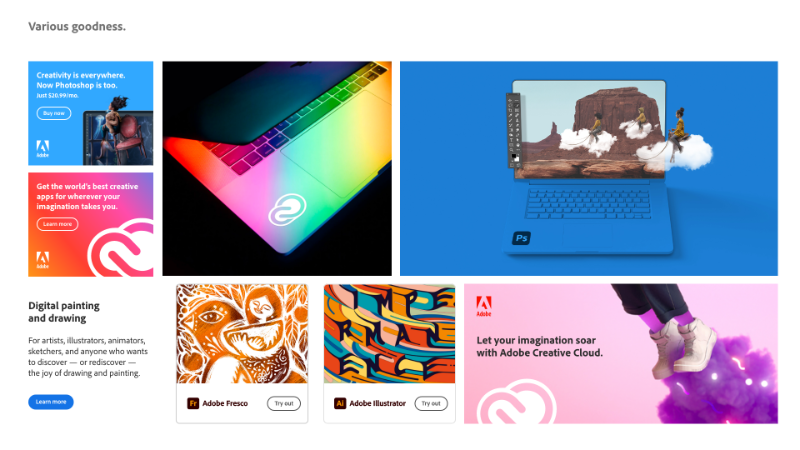
Sprinkled throughout their website you can see Adobe’s ‘open system’ color palette in use especially in the backgrounds or dividers to break up the content, reinforcing their be creative philosophy.
I admire this approach because it avoids restricting them to one style of branding. The open system aligns perfectly with their broad range of products.
You can see that the Adobe Clean font family is used everywhere. This consistency helps keep a uniform visual identity creating a seamless user experience across all channels.
Adobe hosts events and conferences and participates in events that encourage creativity and collaboration, aligning with Community and Forward values.
Some of these events are Adobe MAX and Adobe Summit, these events bring together people from different backgrounds for keynote speeches, workshops, product demonstrations, and networking opportunities. They showcase Adobe’s innovation, community spirit, and commitment to user experience.

Adobe’s Brand Identity Impact
The Adobe red “A” logo is instantly recognizable and people link it with creativity and design software. Not just their primary logo but also their flagship product logos for Photoshop, Illustrator, InDesign etc are instantly noticed. A desktop taskbar or dock just looks empty without those logos there. It’s part of my identity as a designer. Can you relate?
Adobe has loyal customers subscribing to its Creative Cloud platform for years. It’s reliable and delightful to use which equals trust, and trust comes from meeting and beating customer expectations which Adobe does over and over again.
Adobe’s brand identity breaks through language and cultural barriers making it effective in the global marketplace. They listen to their customers, which is part of their core values, and that helps them build the best product for the consumer.
Microsoft
Microsoft’s brand is always adapting to match their evolving products and audience. They focus on empowering people, promoting inclusivity, innovation and taking a human-centered approach. With a broad and diverse target audience, they create personalized messages and offerings.
Visuals Elements of Microsoft’s Brand Identity
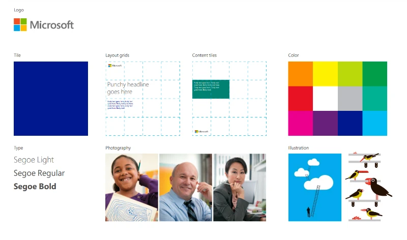
The current logo, introduced in 2012, is a simple, four-quadrant square with varying shades of color representing diversity and possibility. It celebrates their heritage and future, designed for the digital landscape, the symbol shows the diverse range of Microsoft, serving as a representative and endorser of Microsoft’s wide range of products and services.
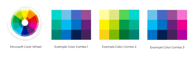
Microsoft’s color palette is primarily blue, symbolizing trust, reliability, and productivity, with accents of other colors depending on the specific product or audience. In total Microsoft has 10 colors, each with a highlight and a tint.
This gives a broad range of color combinations that match their broad offerings.
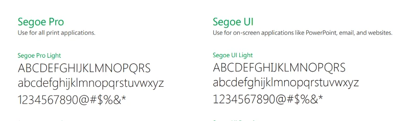
Microsoft’s typography is clear, professional, and has consistent typefaces across different products and communications. Segoe is their font of choice, which is a custom font created just for Microsoft.
They have 2 versions of the Segoe font, Segoe Pro for print and graphic materials and Segoe UI for screens, you can download the font at Media Bank
Imagery is used along with Microsoft’s brand identity but, it has to follow strict guidelines to match the brand, this includes avoiding emotionless images, models posing, or staged interactions with bland colors. As Microsoft puts it in their brand guidelines:
Photos that capture the real world we live in—authentic, optimistic, and brave
Microsoft brand guidelines

Additional visual elements included as part of Microsoft’s brand identity are tiles and content tiles, specific layout grids, icons, and illustrations. Microsoft says that the grid although invisible is crucial to delivering their messages in a clear, simple, direct way.
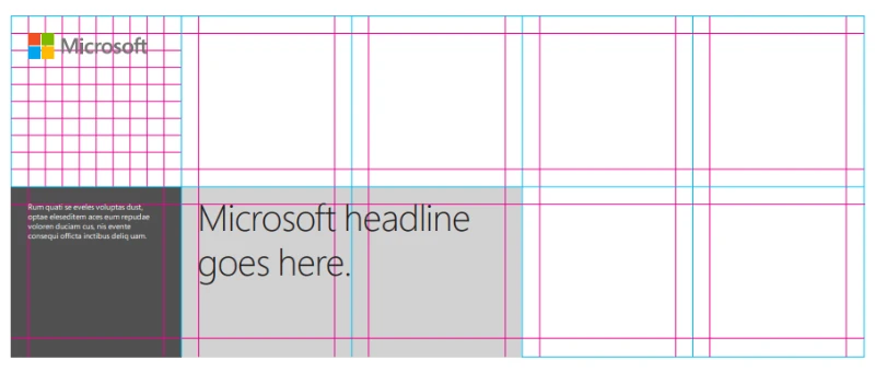
Content tiles are used to create bold color combinations where type can be placed alongside an image illustration or another bold-colored tile.
Here you can see more about Microsoft’s visual identity guidelines. The guide gives you steps on putting together their elements to create your own ‘story’.
Verbal Elements Of Microsoft’s Brand Identity
Everyone knows Microsoft’s name. Whether you mention Microsoft itself or any of its sub-brands like Xbox, Windows, or Microsoft 365, people worldwide will most likely will know what you are talking about.
Something that almost everyone will recognize is their Windows sound effects, for example, the start up chime, the sound it makes when you click on something but it wants you to close another window. If you’re a Windows user you know what I’m talking about.

Personality And Values Of Microsoft’s Brand Identity
Microsoft’s values include supporting people and organizations to achieve more. By creating openness and accessibility for a diverse user base, they actively promote equality. Microsoft continually pushes boundaries, aiming for constant improvement. They place the user at the center of their design and development.
Microsoft’s Brand Identity Across Channels
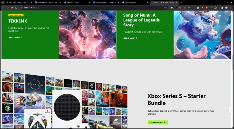
Their website uses a clean, user-friendly design and caters to different users like consumers, businesses and developers. You can see their custom font Segoe UI in play throughout the entire site keeping to their brand guidelines. Also, their primary blue is used as an accent color throughout the site, as well as the content tiling, especially on the Xbox section of their site.
Microsoft’s Brand Identity Impact
On top of global recognition, Microsoft’s brand identity has translated into huge business impacts. This can be seen in many ways:
- Premium Products: Devices like the Surface Pro and Microsoft 365 have leveraged the brand’s association with productivity and design to establish themselves as a premium choice.
- Subscriptions: Xbox Game Pass and Microsoft 365 show how the brand’s focus on accessibility and value drives loyalty and subscription adoption.
- Cloud computing: Microsoft Azure’s secure and reliable image has attracted major clients and partnerships, solidifying its position in the cloud computing market.
Remember when it comes to branding it’s about personality and the target audience because it’s the audience that will be connecting with the brand.
Do you need help creating your brand identity? See below